
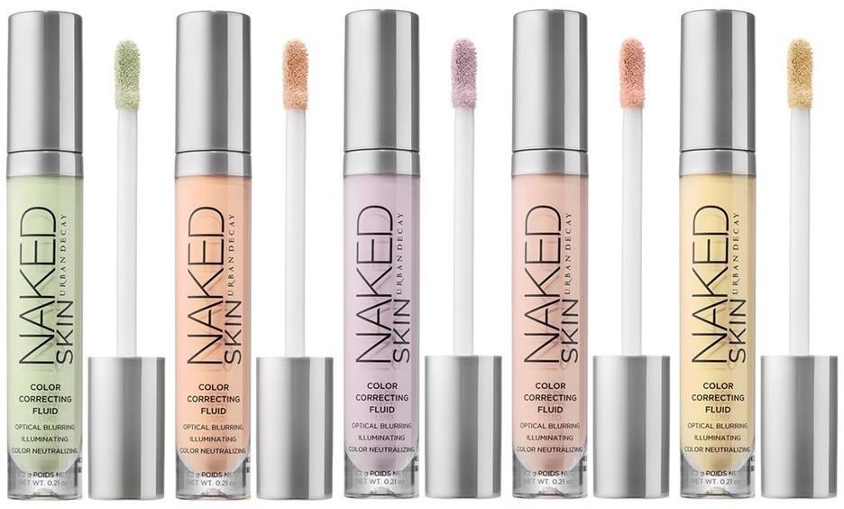
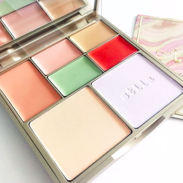
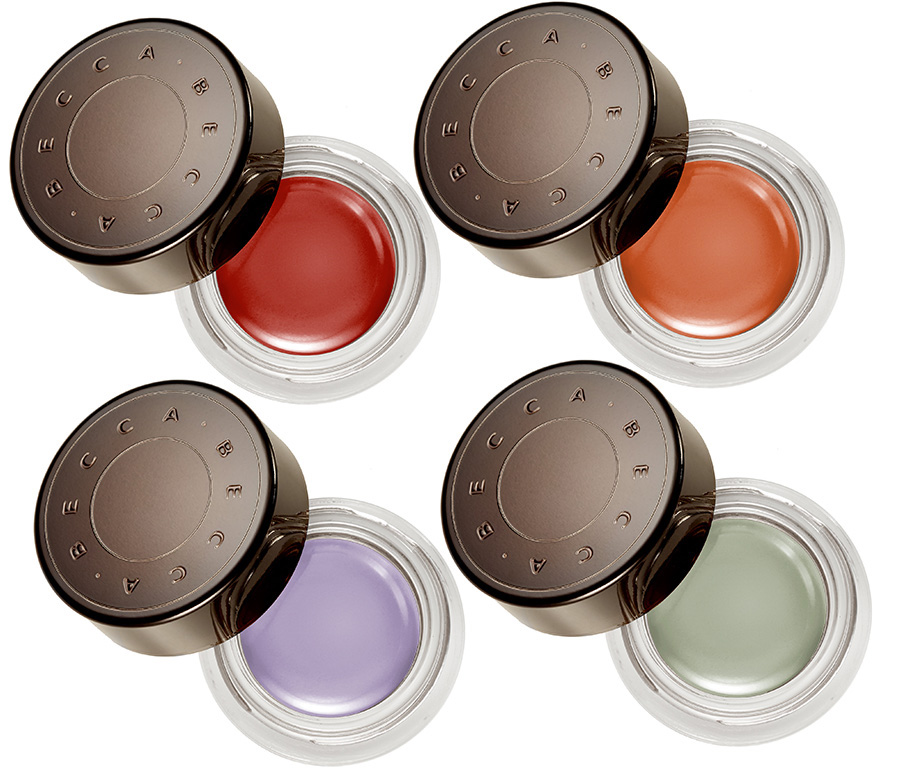
I don’t know about you, but everywhere I look these days, brands are releasing colour correctors. Urban Decay, Stila and BECCA, to name a few, have all recently released sets/palettes to help you zap any unwanted discolouration, and I’m sure I speak for all of us when I say “GIMME”.
If you’re feeling a little overwhelmed by the sudden influx of colour correcting products, and are a little confused about how they work and how to use them, then don’t worry, I’ve got you covered! In this post I’m going to give you a very quick run-down of what colour correcting is and how to make it work for you.
In order to properly understand colour correcting, you need to first get to grips with the colour wheel:
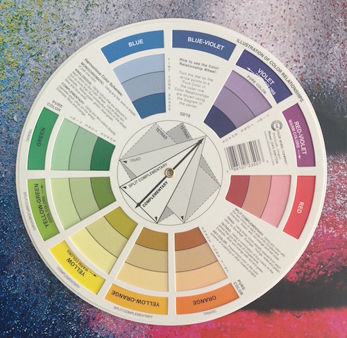
Colours which are complimentary (located directly opposite one another on the colour wheel), neutralise each other when one is placed on top of the other. So, if, for example, you have a blemish, applying a green colour corrector over it will help cancel out its red hue. For blue/purple under-eye circles, red, oranges and yellows are your friend. If you have sallow skin, or notice that the centre of your face is looking a little dull, a purple shade will help brighten your complexion. If you want to cover veins or bruises, you will need to assistance of a yellow corrector.
The shade of your skin will help you determine the intensity of the required colour corrector. For example, light skin tones like mine require correctors with peachy/salmon tones (a mix of red, orange and yellow) to brighten the under-eye area and eliminate signs of fatigue. Olive/tanned skin tones should use a corrector with more of a yellow base, and darker skin tones will benefit from something with more of an orangey/red base. For concealing redness, lighter skin tones require more of a pastel green, whereas darker skin tones can go for deeper shades of green. You get the drift.

Colour correctors must be applied prior to foundation, and I like to apply mine using my fingers or a small concealer brush. Using your finger can be advantageous here, as your body heat will soften the product even more, helping it melt into the skin . I push a small amount of the product onto the most discoloured areas of the skin and softly blend away the edges so that there are no obvious lines. Remember to concentrate your placement only on the areas that need it! Once you are happy, gently apply your foundation on top, being careful not to displace the corrector underneath – you don’t want all your hard work to go to waste! I find a beautyblender to be particularly effective as it presses the foundation on top without shifting any of the corrector underneath. However, if you would prefer to use a brush, then just remember to stipple/push the foundation onto your skin, don’t buff it. If done correctly, the colour corrector should not be visible once you’ve finished with your foundation – you face should look completely flawless and free of any discolouration. You can then follow on with your concealer and powder, should you wish (a light-reflecting concealer under the eyes is a must for me).
To help tie all this theory together, I have included a YouTube tutorial from my latest crush, Canadian beauty blogger Jamie Paige. In this video she shows you exactly how to use colour correctors (she is using the BECCA Backlight Targeted Colour Correctors) and demonstrates how wonderfully effective they can be:
If you would like some locally available colour correctors, let me know and I will be happy to oblige. I hope you have found this post useful!